
Order Confirmation Page Redesign

The purpose of this design was to create a simple page where people can see all details of the product they have ordered.
The software needs to be easy to download, along with it's license key.
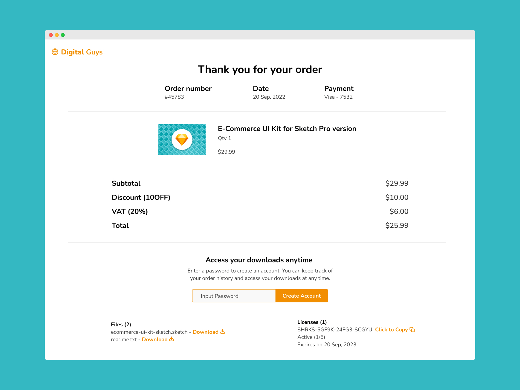
With the completed design above, I'll go through a breakdown of each of the most important sections, why I included them and the way they are interacted with.
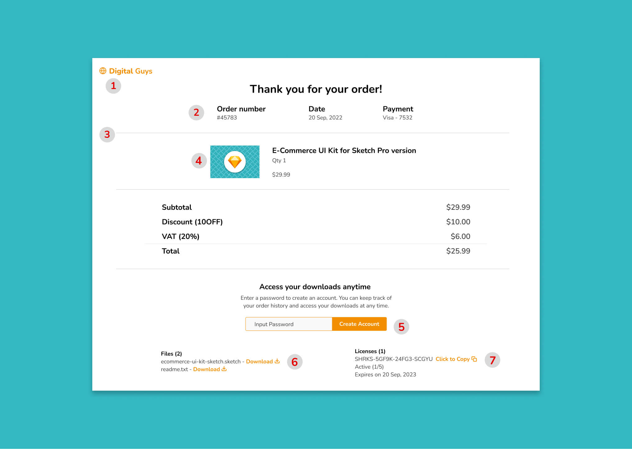
1. Logo
I've placed the logo at the top left of the screen. We expect logos to be located here on websites, so I wanted to stick with best practises.
2. Order Information
This contains information a person would need to be able to see right away if they had a problem with their order. That's why I wanted to make it readily available. It's not the kind of thing people want to search for.
3. Dividing Line
A simple way of seperating information that belongs to different categories. It keeps the design organised and easier for people to skim through.
4. Software Product Image
This is for people to be able to quickly identify the product they have purchased. Again, useful for skimming purposes.
5. Account Creation
This is to give people the option to create an account if they didn't do so when they initially purchased.
6. Product Download
The link they click to download the software has been clearly highlighted with orange text. There is also a download icon beside the orange link to visually explain the purpose of the text.
7. License Keys
Most software have license keys needed to activate the product. Click to copy is a useful feature here because it saves people the hassle of needing to highlight the entire text of the code in order to be able to copy it.
Similar to the download link, a copy icon has been included beside the text.
The journey of a thousand miles begins with a single click.
Start your quest off right by getting clear on the path ahead.