
Soul & Compass Brand Kit

Logo
Typography
Colour Palette
Illustrations
Mockups
Icons
Logo
Typography
Colour Palette
Illustrations
Mockups
Icons
Logo


Brandmark
Typography
Literata
This typeface is used for headings.
The bold weight is used for headings, while semibold is used for button copy.
The optical settings of each font are set automatically. This is to communicate the approachable nature of the brand.
In certain circumstances (e.g. for large headings), the optical settings may need to be reduced manually. This is at the discretion of the designer.
Semibold
Bold
Literata
ABCDEFGHIJKLMNOPQRSTUVWXYZabcdefghijklmnopqrstuvwxyz
0123456789
Alegreya Sans
This typeface is used for paragraphs.
Regular
Regular italics
Bold
Alegreya Sans
ABCDEFGHIJKLMNOPQRSTUVWXYZabcdefghijklmnopqrstuvwxyz
0123456789
alegreya sans sc
This typeface is used for microcopy.
When setting microcopy, all letters are set to the same height - we don't use extra capitalisation for the first letter of a word.
Additional letter spacing of 1px is used.
bold
alegreya sans
abcdefghijklmnopqrstuvwxyz
0123456789
Colour Palette
The primary colours of Soul & Compass are Sacramento Teal and Golden Soul.
Skydome is used sparingly to highlight key information e.g. microcopy and the background of primary buttons.
Tints and shades of the primary colours can be used where appropriate. For headline text 80% shade (#01090A) is used.
For body copy, the same colour is used except at 80% transparency (#01090ACC).
For section backgrounds, digital and print documents, 60% tint of Golden Soul is used (#F7EDDE).
20%
40%
60%
80%
#072D30
20%
40%
60%
80%
20%
40%
60%
80%
Golden Soul
#EBD2AD
20%
40%
60%
80%
Skydome
#3AA5CF
Gradients
The gradient #072d30 to #01090A is used to transition between sections. This colours of this gradient reversed are also used.
The following css settings are used:
background-image: linear-
Gradient 1
Gradient 2
Illustrations
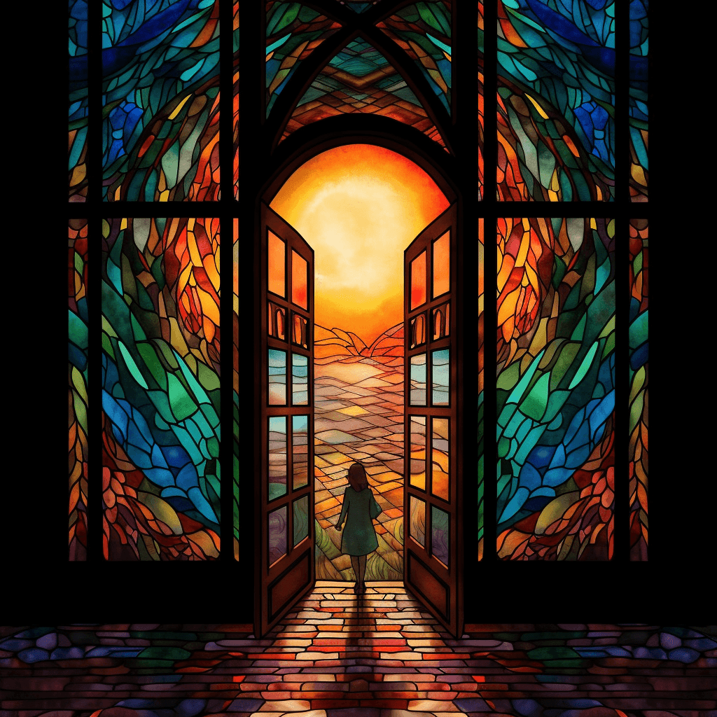
The style of illustration used across the brand is inspired by stained glass windows.
Stained glass is an artistic medium which is usually associated with churches and other religious institutions.
Religious affiliation is not a component of the Soul & Compass brand, but we recognise the value in building things that endure. We use stained glass imagery to reinforce the ideas of lifelong connection, long-term thinking and a dedication to excellence.
All illustrations must have a hopeful, aspirational tone. They should be non-religious in their composition & reinforce the messaging of whatever content they accompany.


Symbols
For top-level headings, a dividing line is used to separate the heading text from the elements that follow it.
At present, this is the only codified symbol we use. Additional symbols will be added over time if/when needed.
Mockups
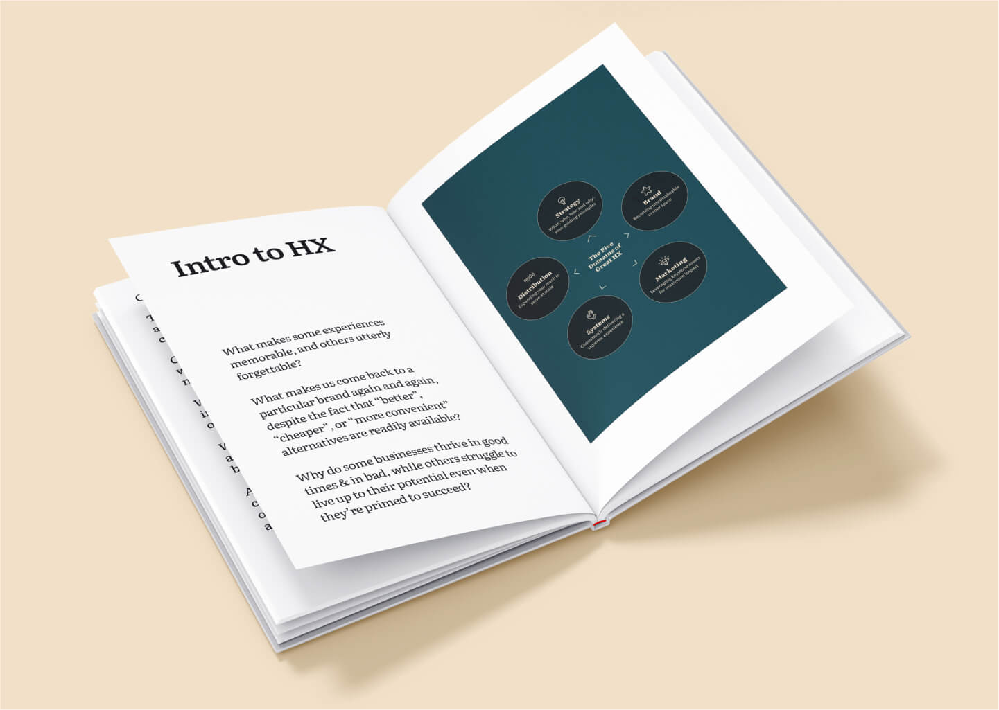
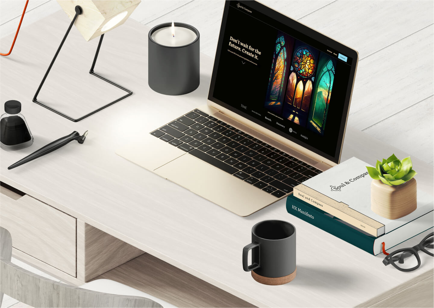
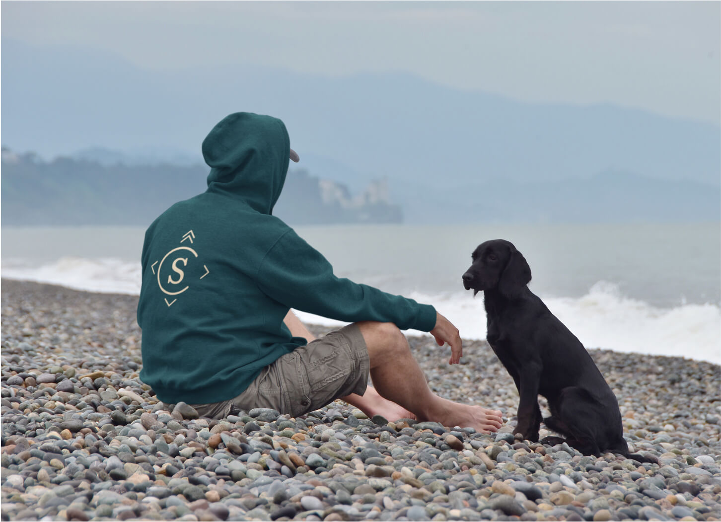
The style of mockups used across the brand are minimal, professional and consistent.
They feature our brand colours and serve to demonstrate our core values of connection and excellence.
Composition of all mockups should reflect our brand values and align with the broader aesthetic of the context they're used in.
To balance the presentation of elements within a mockup, non-brand colours can be used sparingly for variance. Note that this applies only to supplementary assets pictured within a mockup. All core items should remain congruent with our defined palette.

Iconography
We use icons the wired icon style from Lordicons. Where appropriate (3 or less icons will be displayed) we use the animated versions of the icons.
For offline documents, or where there will be more than 3 icons displayed together, the static svg versions are used.
One solid colour is used for iconography.
Icons are displayed at a minimum size of 16px. If not displayed at this size, the values used must be a multiple of 8. Generally, icons will not be displayed larger than 64px.
Animated
Static



Need anything else?
Just send us a message - we're here to help.